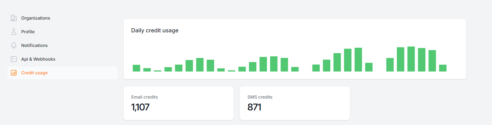
Usage credits graph doesn't display correctly
The usage credits graph inside a client's account only displays a bar, but the label is "series-1" and doesn't split out email / sms. Shouldn't this be a stacked-bar graph labelling the two (and eventually AI usage / locations / users)?
Another pro-tip: we should have an "upgrade plan" button in this page to incentivize clients to upgrade their plan to higher credit usage.
Log in to comment and vote
Comments1
Patrick
Mar 19, 2025
@mannie@embedmyreviews.com Any status on this one? I’m noticing other bugs with the usage & credits, which are very important & central to the software & the plans we sell. I will post an update on the bugs in another thread.
Ideally, this graph would show a stacked bar chart w/all usage numbers (not just lumped together) & a line with remaining balance over time.